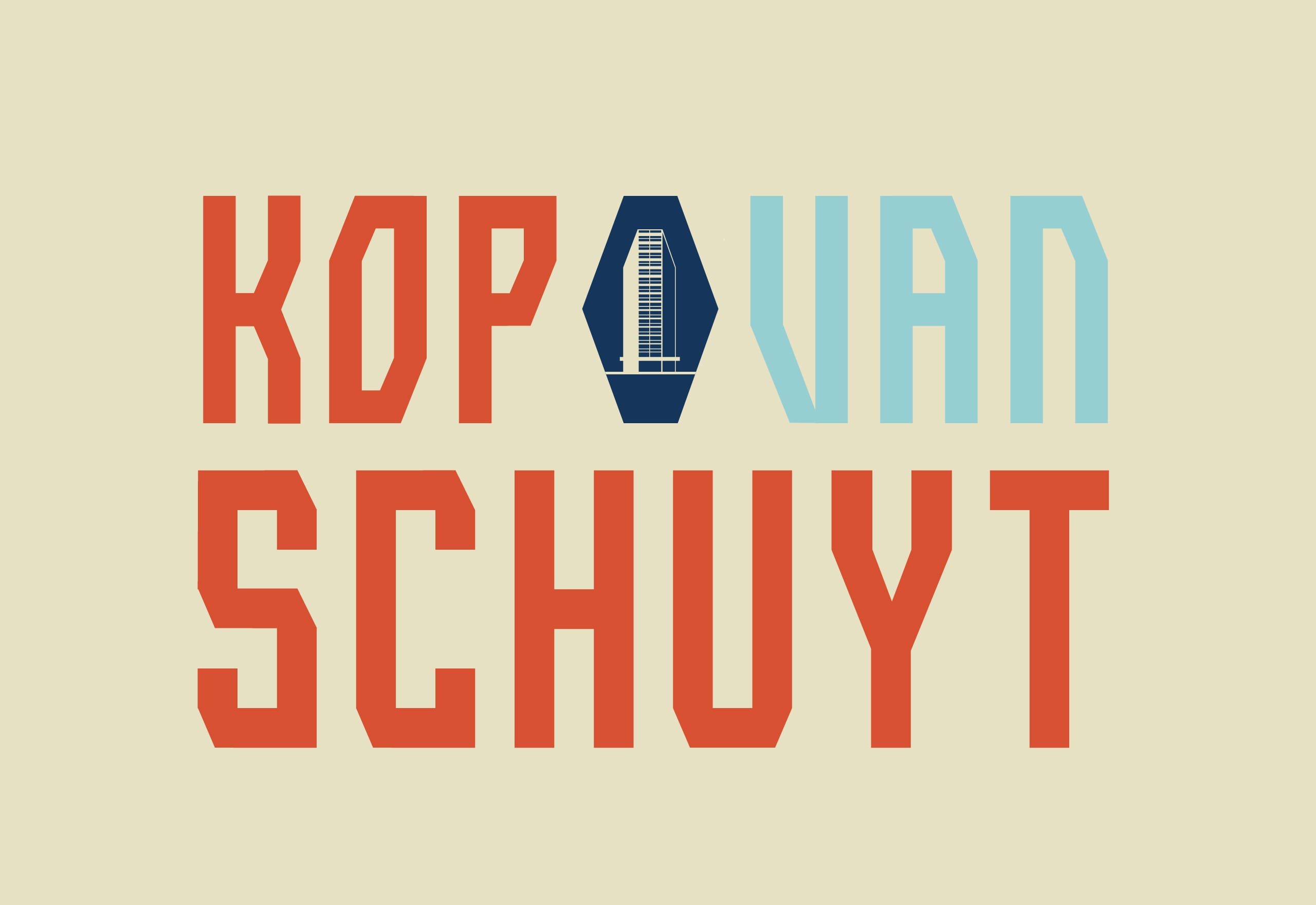
Kop van Schuyt
Koopmans TBI Tender
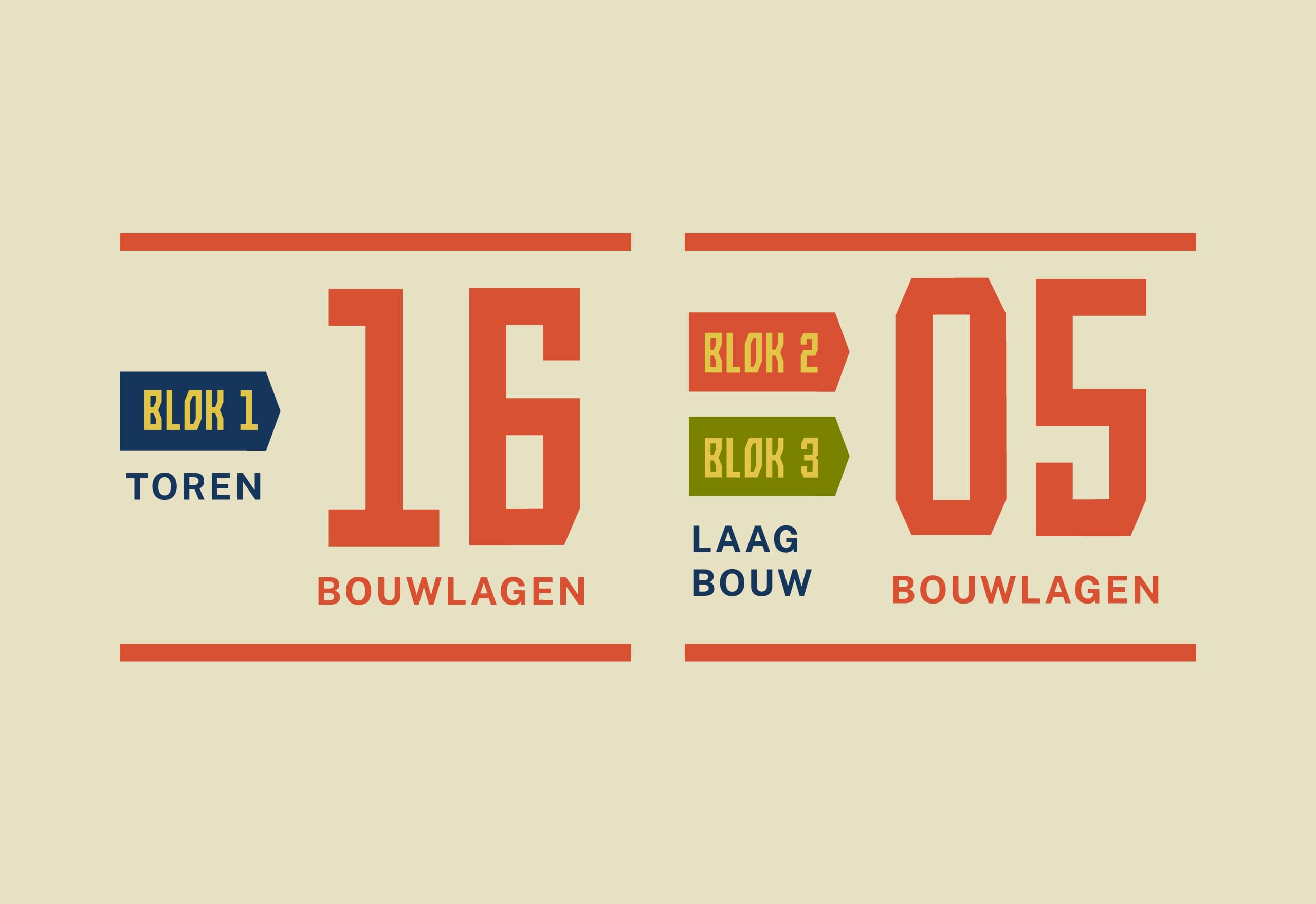
Visible from afar, with a height accent of 50 meters, an iconic building and beacon of the surrounding residential area: Kop van Schuyt. A tender for which we developed the concept, design, and implementation. The characteristic lines and shapes of the building were the starting point for the logo and typography.
Clear, strong and convincing
For the tender in Arnhem, Mooi Creatie excellently supported us with the graphic design and branding of Kop van Schuyt. Through close collaboration, not only was the name conceived, but a complete visual identity was developed that perfectly matches this iconic building in Schuytgraaf. The collaboration was pleasant: efficient and fast, yet always with creative surprises that made the difference. The end result stands firm: clear, strong and convincing.
Koen Kraesgenberg
Team Leader Client & Market | Koopmans TBI
Custom designed font
Typography inspired by the building's character
Would You like to Discuss Ideas over a Cup of Coffee?
Curious about the people behind Mooi Creatie? What motivates us and what we enjoy working on most? Come by for a cup of coffee, we would be happy to tell you more (okay, maybe not everything).


